Project information
- Category: Database
- Project date: 26 November, 2021
- Project URL: Click Here
About the project
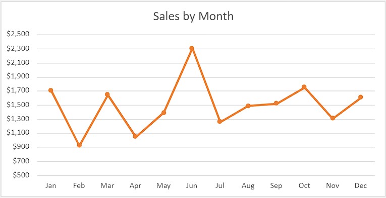
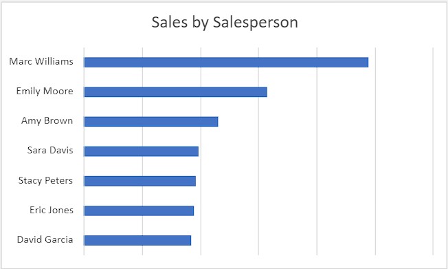
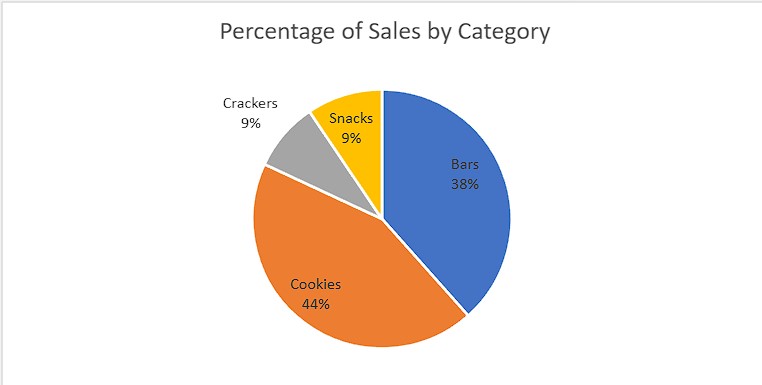
In this project, I learned how to create charts in Microsoft Excel to analyze sales data of a sample company. l learned how to create PivotTables to assess different aspects of the sales information, and represent the information from the tables as line, bar, and pie charts. When creating the charts, I learned how to format them so they are easily interpreted and you will then assemble the charts in a dashboard to provide a global picture of the sales data.